

The Big Data age is unquestionably here. In recent years, the volume of data collected and stored by business and government organizations has snowballed. Driven by reduced costs of storage and ever increasing analysis capabilities Big Data has become a big industry. The benefits of Big Data have also been widely reported, the McKinsey Global Institute (MGI) has cited examples of the transformative effect of Big Data from sectors as dispersed as health care to retail to manufacturing to political campaigns (Manyika et al., 2011). Research conducted at the Massachusetts Institute of Technology shows that companies that use “data-directed decision making” enjoy a 5% – 6% increase in productivity, and that mass analysis of mobile phone calling patterns can help detect flu outbreaks (Boyd, & Crawford, 2012; Kirkpatrick, 2013). Big Data has also been put to use in humanitarian efforts, researchers from Sweden’s Karolinska Institute and Columbia University have used data from Digicel, Haiti’s largest cell phone provider, to determine the movement of displaced populations after the 2010 earthquake, aiding in the distribution of resources; Tweets in Indonesia have been analysed to predict how people fare with food price volatility, allowing pre-emptive measures to be put in place to reduce scarcity shock. And social media output anlysis in the United States and Ireland have shown to be good early indicators of spikes in unemployment (Kirkpatrick, 2013.
It is the combination of this rich data source, collected through mobile devices, coupled with the Big Data Paradigm – which promises to turn ever larger and imperfect, complex, often unstructured data into actionable information, within a discourse of increased speed, efficiency and inclusivity (Hilbert, 2013; Burns, 2014) – that presents exciting opportunities for geographers, GIS analysts and the GI industry as a whole. By 2020, more than 70 percent of mobile phones are expected to have GPS capability, up from 20 percent in 2010 (Hilbert, 2013), leading to a massive increase to the flood of spatially located data already generated every day. The Big Data Paradigm suggests that the more data we have, the better our predictive modelling and analytics will be. Caution, however, must be taken in our rush to exploit these new vast pools of data and information for predictive analysis.
The evidence for a more nuanced approach to combining Big Data and GIS comes from a surprising point in mapping history, namely the unpicking of the mythology surrounding John Snow and his infamous 19th Century Cholera maps. Through an exploration of John Snow’s methods and the application of the principles of critical, participatory and feminist GIS, this paper seeks to ground our understanding of the value of Big Data in GIS and remind us of the under lying principles of GIS analysis.
Snow’s study of the ‘‘Broad Street outbreak’’ has long been heralded as the start of spatioanylitical research and is oft cited as a fundamental example of epidemiology and medical geography (Koch & Denike, 2009). Our fascination with the map however, has somewhat distorted our understanding of the methods employed in its creation, and the conclusions that where drawn at the time. Two misconceptions persist around Snow’s maps that have implications for how we merge GIS and Big Data. Firstly, that it was his maps that led Snow to reach the conclusion that Cholera was water born. And Secondly, that his maps provided good evidence for this conclusion.
When Snow first presented his hypothesis to the parish officials that the water pump maybe the source of the Broad Street outbreak he neither presented a map, nor did he allude to the idea that a map had been instrumental in his discovery (Bordy et al., 2000). Moreover, the first edition of On the mode of communication of cholera, published in 1849, contained no maps, it was not until 1854 that his spot map was first published, possibly due to the influence of Shapter, whom Snow had cited in OMCC’s second edition. It would appear then that Snow had developed and tested his hypothesis well before he drew his map. This is not an unlikely scenario given that he was already engaged in an ambitious study of cholera in South London. It was likely these earlier studies that led him to conclude that a sharp localised outbreak pointed to a contaminated pump rather than, as commonly reported, an induction arrived at primarily from the geographical facts of the case (Brody et al., 2000). Snow’s map then did not give rise to the insight, but was the tool used to confirm and illustrate an already held hypothesis and conclusion.
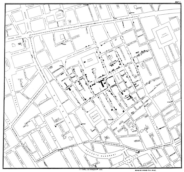
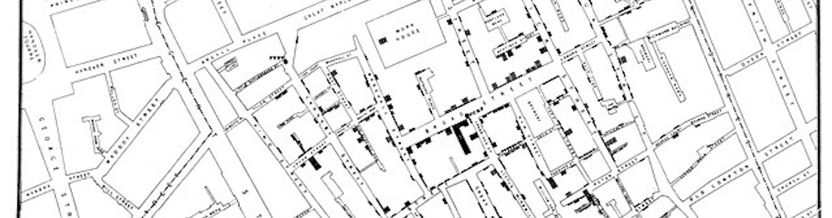
Original map made by John Snow in 1854. Cholera cases are highlighted in black. Published by C.F. Cheffins, Lith, Southhampton Buildings, London, England, 1854 in Snow, John. On the Mode of Communication of Cholera, 2nd Ed, John Churchill, New Burlington Street, London, England, 1855. This image is in the public domain due to its age
More widely known about Snow’s work is that, despite his body of evidence, he had a hard time convincing those around him that the water pump was the source of contamination, leading to the emotive myth of him striding into Broad Street and breaking off the water pumps handle. Snow’s contemporaries, his readers and the parish had been unconvinced by his arguments. It was not so much his theory to which they objected, but rather his lack of detailed consideration of other potential sources of contagion (Koch & Denike, 2009). It was this lack of support for his ideas that led Snow to draw his maps, to prove and illustrate his theory. Simply plotting deaths on a map, however, did not lead others to reach the same conclusions, nor the immediate, unquestioning adoption of his theory (Brody et al., 2000). “On examining the map given by Dr Snow, it would clearly appear that the centre of the outburst was a spot in Broad-street, close to which is the accused pump; and that cases were scattered all round this nearly in a circle, becoming less numerous as the exterior of the circle is approached. This certainly looks more like the effect of an atmospheric cause than any other” was the conclusion reached by Edmund A Parkes in his review of On the mode of communication of cholera (Parkes, 1855: 458 cited in Brody et al., 2000). Indeed spot maps such as Snow’s had previously been used by both contagionists and anticontagionists to advance their stance in Yellow Fever research as early as 1798 (Brody et al. 2000). Snow’s map alone was not enough to convince either his contemporaries or other parties as to his, albeit correct, theory.
What can we learn from Snow and his approach in the age of GIS and Big Data, and how to we integrate this in our work? The trap of examining Snow’s work is in positioning him as a mapmaker without an appreciation of Snow the thinker. Data are meaningful because of how someone collects, interprets, and forms arguments with it. Data are not neutral. The goal of Snow’s maps was not to produce data, but to filter data, to reframe his hypothesis. Snow’s original theorem was discounted, his map was misinterpreted, but together they were able to support each other, leading to the saving of many lives. The Big Data age is moving us into a new epistemology in which knowledge politics are deeply embedded in what counts as data, how those data are represented and the proposes for which those representations may be used. Evidence has shown that we will continue to see marginal increases in predictive performance even to a massive scale (Junqué de Fortuny, 2013), but these increases are useless if we are representing this data through a epistemology that embodies an unquestioned form of legitimacy and power, such as that often given to map-based artefacts, and which leads to wide misinterpretation or which is based on unsound hypothesis. Big Data, plotted in the form of a highly sophisticated and accurate map, may easily seduce us into concluding that we have learned something.
Big Data should be considered as less a physical entity and more as a paradigm shift. It won’t solve issues on its own, but it allows us to think differently. Big Data thinking opens our view to non-traditional data for predictive analytics, but we must be careful as we embrace this technological idea not to become besotted by it. Key to the integration of Big Data as a meaningful tool of analysis is ensuring that Big Data is viewed as much as a social innovation as a technical one. The future of GIS isn’t about pulling mass amounts of data towards the centre like a black hole, it’s about pushing for simple, purposeful and considered data collection leading to better collaboration, analysis and understanding. While our understanding of Snow’s map production and methodology might be skewed by myth and legend, the truth of the story is still a shining example of how to blend mapped data, visualisation and theory. The Broad Street maps and Snow’s work demonstrate that the mere act arranging data graphically in space does not yield new understanding without the support of a solid, considered and researched theory, and that our theories will be widely dismissed if we have not explored all hypotheses and represented them appropriately, regardless of the size of our Big Data set.
References
Boyd, D., & Crawford, K. (2012). Critical questions for big data: Provocations for a cultural, technological, and scholarly phenomenon. Information, Communication & Society, 15(5), 662-679.
Brody, H., Rip, M. R., Vinten-Johansen, P., Paneth, N., & Rachman, S. (2000). Map-making and myth-making in Broad Street: the London cholera epidemic, 1854. The Lancet, 356(9223), 64-68.
Burns, R. (2014). Rethinking big data in digital humanitarianism: practices, epistemologies, and social relations. GeoJournal, 1-14.
Hilbert, M. (2013). Big data for development: From information-to knowledge societies. Available at SSRN 2205145.
Junqué de Fortuny, E., Martens, D., & Provost, F. (2013). Predictive Modelling With Big Data: Is Bigger Really Better?. Big Data, 1(4), 215-226.
Kirkpatrick, R. (2013). Big Data for Development. Big Data, 1(1), 3-4
Koch, T., & Denike, K. (2009). Crediting his critics’ concerns: Remaking John Snow’s map of Broad Street cholera, 1854. Social science & medicine, 69(8), 1246-1251.
Manyika, J., Chui, M., Brown, B., Bughin, J., Dobbs, R., Roxburgh, C., & Byers, A. H. (2011). Big data: The next frontier for innovation, competition, and productivity.


